
Case Study: Madison-based Information Technology Professionals (ITP)
 Client: Information Technology Professionals
Brief: Design a branded presentation folder with a one-page marketing slick. The deliverables needed to incorporate the company tagline while representing their primary services. It also needed to include client provided photography.
A Great Start: A company that boasts nearly 20 years of experience, Information Technology Professionals (ITP) provides managed IT service and technology solutions. Their clients are small to mid-sized businesses in Wisconsin. Tingalls Graphic Design has not only designed their award-winning website, but also a host of icons they use in print collateral, social media, and newsletter design. Staying on brand and on target with a look that embraces their business identity has been the primary focus with each project. Their most recent request for a presentation folder with a one-page marketing slick was no exception.
A History of Success
We first started working with ITP when they reached out to Tingalls for a website redesign. They were looking for a user-responsive site that would guide their audience to appropriate content in an intuitive way. The idea was that the experience becomes customized for each visitor. Adding various features such as video overlays, large button design, and “mad-lib” dropdowns on the homepage worked perfectly. Tingalls was honored in 2018 with a Silver Addy at the 50th Annual American Advertising Federation awards for their work on the ITP website.

“Mad-lib” feature on homepage consists of input fields that are embedded within a sentence, written in natural language
ITP specializes in the manufacturing, medical, and professional services sectors so, the website had to appeal to that audience. The new website not only met their requirements, but it also embraced a brand strategy that continues to this day.
Since the launch of its website, the company’s consistent growth has landed it on the prestigious Inc. 5000 list for the fourth year in a row. CEO, Paul Hager was also honored with “Chief Executive Officer of the Year” from InBusiness Madison in February.
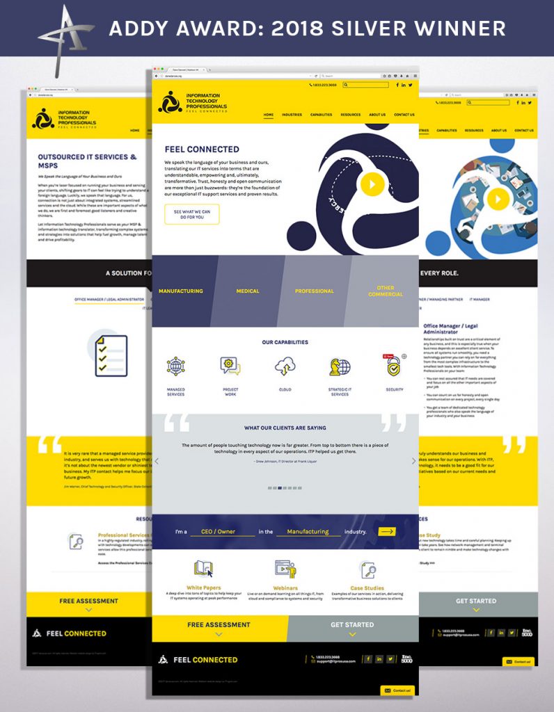
ITPros website is the perfect example of using a brand strategy to appeal to a specific audience.
The Latest Project
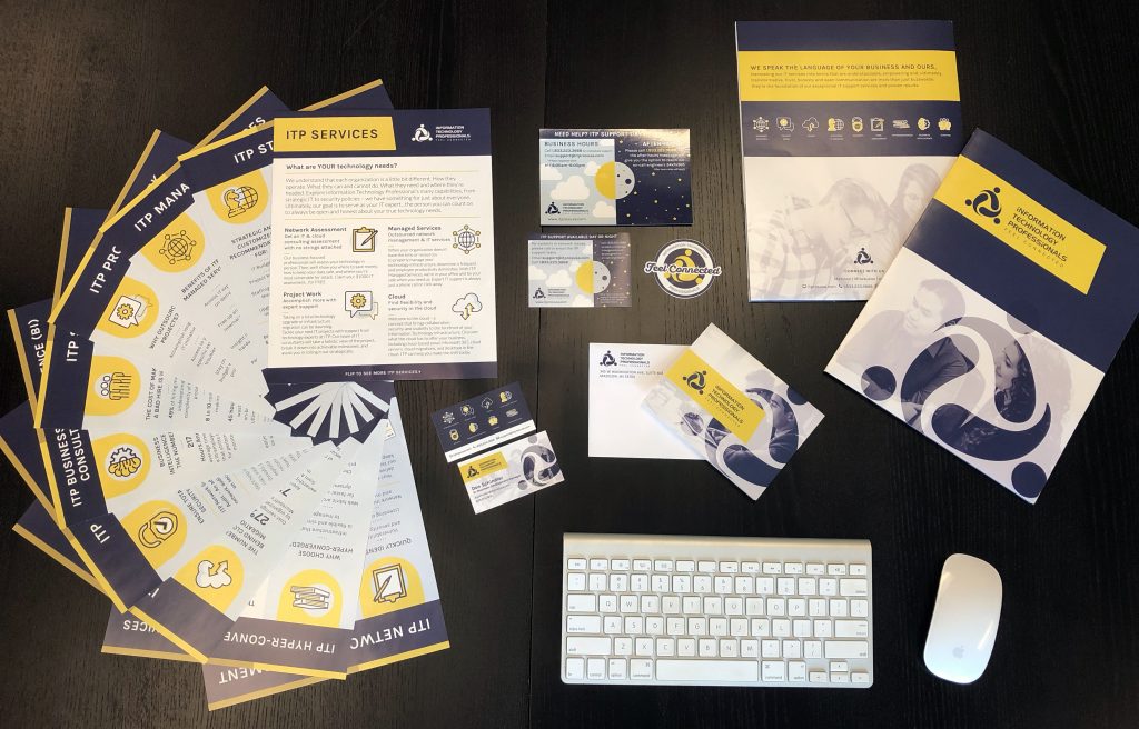
With accolades like that, working with them meant embracing their success. We needed to make it shine through not only their website but all their marketing material. So this week’s case study looks at one of our most recent projects with them – a branded folder design. It would be accompanied by a series of sales slicks to be presented to prospective clients. They wanted a fully customized & unique look that incorporated their brand identity. Our aim was that these materials would showcase their culture along with their brand and highlight their tagline “Feel Connected.” The challenge was to make a complex topic like technology and the services offered by ITP clear and easy to understand for the reader.
Ellie Sherven, Marketing Director at ITP, approached the project with infectious excitement. The project not only included creating a well-designed presentation folder, but it needed to follow the brand tone — the finished product needed to be visually appealing and relay important information about ITP services.
We created a folder that was reflective of the high-quality work that the company offers. Using the company brand, colors, and look, the designer provided a distinct marketing objective. The outcome would be attractive, useful, and hold all the necessary marketing materials, including the new sales slicks.
Sitting down with our designer, Alyssa, revealed a steady creative process. She balances her creativity with careful project management and a solid client relationship.
What was the experience like for you as a designer?
I’ve worked with this client to build a strong, clear, established brand throughout several projects, including digital ads, internal company culture pieces, event collateral, presentation materials, and much more. So, the client and I have a system. In an email, she provides me with the content and parameters for the project, and I can take it from there. For the folder, the client wanted a very custom feel that incorporated their message, primary services, and the new photography the company had done.
What did you find challenging about the project?
The challenge of this piece was to include all of the elements without it feeling overwhelming (a common concern). I focused on the front of the folder being eye-catching and bold, the back including information, and making sure there is a seamless transition between the two. The sales slicks needed to complement the look and feel of the folder, have consistent design throughout (there are 11!), as well as each being easy to differentiate from the other (the challenge!).
How did you approach it?
I was able to create a structure to feature important information in the same manner for each. Using a unique icon to set them apart allowed viewers to be able to easily take in the information, which is why I kept the structure for each sales slick the same. They know what to expect when reading the next. The bold design of the folder draws the viewer in, and the structured sales slicks help them understand the service areas with ease. The icons and design elements are consistent throughout the brand, and these pieces are no exception!
How do you feel about the results?
I’m quite happy with how they turned out! These pieces are a perfect example of brand consistency, which is SO important when trying to create brand awareness and recognition. We’ve built a great relationship with this client, and working together is a pleasure. We have minimal drafts, and both of us are excited about the outcome.
Who else would you like to credit for helping?
I want to give LOTS of credit and props to Whitney, the initial designer for this client and a part of the Tingalls team for eight years. She did such a great job with the website in particular.
A Future for Success
Consistent growth and a stellar reputation within the IT community promises to keep Information Technology Professionals (ITP) as one of the lead players in its field. As their primary graphic design partner, the Tingalls Team looks forward to watching their success and supporting their efforts!
Related Posts