Website Trends from Tingalls Graphic Design
Tingalls Graphic Design has seen the world wide web play a more important part in our business and in yours over the past few years.
Website design is one of those ever-changing fields that is often dictated by trends and public demand and acceptance. While some trends are absolutely spot on and important for the evolution of your website, others are exactly the opposite and can turn off your target audience. And some trends are just like fashion; your look doesn’t affect performance, but your customers may find you outdated.We’ve looked at our web design projects for the last few years and made note of a few of the positive trends that we think are here to stay.
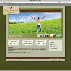
Graphic elements on the home page. Grabbing the attention of your audience with a visual (quite often it’s a photo rotation) on the home page has become very important. Gone are the days where the home page is packed with pages and pages of content, telling the viewer everything about you. Today’s home page is succinct and visually appealing, inviting the viewer to come in and learn more.
Eye catching websites. This is a phrase we hear repeated over and over. Much like the trend above, it’s all about grabbing the viewer’s attention. But, while the trend above deals specifically with images, this one is more involved. Creating a company logo that is visual appealing is essential. Bold colors and simple, easily discernible images are very hot logo trends.
Horizontal navigation. In the past a navigation bar that stretched down one side or the other of the page was rather typical, we’re now seeing more of them running across the top of the page in a horizontal fashion. This is one of those changes that doesn’t affect the functionality of your page at all but is becoming the expected norm.
Video elements. People love video and it’s easier and easier to incorporate them into a company website, so that is what people are doing. The key here is to come up with videos that are engaging and entertaining and that will actually be viewed by visitors.
Simple, clean designs. Imagine a teenager’s bedroom, you don’t want to go inside if it’s cluttered with “stuff” everywhere. This is kind of the same concept with a website. Companies no longer want to throw everything at their customers at once, instead they want you to feel comfortable and to spend time on their site looking (and easily finding) the information you want.
Obviously, we’re not suggesting everyone change their website to conform to these website trends, as being unique is important too, but you may want to review your website and decide if you think making some changes will improve your appeal to your audience and give you a fresh new update.

