Why do my logo colors look different on different screens?
![]() One of the most common questions we get at Tingalls Graphic Design, and one of the most perplexing problems clients can have, is why my logo or company color schemes look different on different mediums.
One of the most common questions we get at Tingalls Graphic Design, and one of the most perplexing problems clients can have, is why my logo or company color schemes look different on different mediums.
The answer is a little complicated, but first thing – think of buying a television. Think of that wall of illuminated flat screens, glowing in the back of Best Buy or wherever you get your electronics. They all have different features and different technology – sure, they are all TVs, but Sony does it differently than Samsung.
Keep that image in your head while you read – the different way things appear on those TVs – some things are bright, some muted, crisp, clean, fuzzy, vivid, dizzying.
What is Color?
Color is complicated. We don’t have time for a physics course, but simply put, color is how objects reflect light. A blue object is actually absorbing other light waves and reflecting only blue.
Monitors, Screens
15 years ago, monitors and TVs were big clunky screens that were powered by cathode-ray tubes. These days the flat screen has replaced the CRT, but they work in a similar way. The computer monitor – much like a TV – uses tiny dots (pixels) that change color. These dots change color – Red, Green and Blue. They blend in combinations to make different colors. This is RGB color. RGB adds colors to make new images.
Ink Colors
Ink on the other hand, is blended in combinations of Cyan, Yellow, Magenta, and Black. Another difference is the light absorbing properties of the ink colors. Therefore, CMYK is subtractive when making colors. Remember, color is the light waves reflected from an object.
Why Two Color Models?
Simply put, your monitor must change with new screens and images. RGB is additive and can change as needed. CMYK is permanent ink – once on paper – it’s there. The two technologies don’t exist in the same space – so, comparing them is difficult.
Remember, Red is not Magenta and Blue is not Cyan. They are similar, but different. So it is impossible for RGB colors to be the same as CMYK. Now lets go back to the wall of TVs at Best Buy. The hardware and software in each one of those devices is different – while still using RGB, it’s very difficult for them to appear exactly the same.
If you add to the mix personal settings (brightness or contrast) there’s no way you’re going to be able to match a printed color with a screen.
What Should You Do?
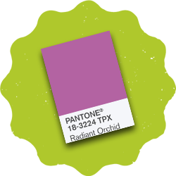
Pantone colors are CMYK and are used as an industry standard. While Pantone Matching System (PMS) is the most accurate, they provide RGB versions for many of their colors. Often they don’t match. It’s a side effect of the two technologies.
If you have questions about your corporate color palette or if you’d like to stop by to see your colors in a Pantone swatch book, just let us know!
Related Posts