Tingalls Culture
![]() At Tingalls Graphic Design, we work really hard. Taking ideas from our clients’ minds and turning them into a visual reality is challenging at times. We work just as hard to keep our creative work fresh and innovative. To do this, we embrace some non-traditional methods.
At Tingalls Graphic Design, we work really hard. Taking ideas from our clients’ minds and turning them into a visual reality is challenging at times. We work just as hard to keep our creative work fresh and innovative. To do this, we embrace some non-traditional methods.
Spoons
By now, if you’re a client or a fan, you’ve heard about our Spoons competitions. We value the importance of working with a clear mind and sometimes a little game of competitive Spoons at the pub table in our office does the trick.
Work Environment
Tara Ingalls, the owner and creative director of Tingalls Graphic Design has taken major steps to make sure the work environment it up to the creative challenge. One way she’s done that is by surrounding team members with colors.
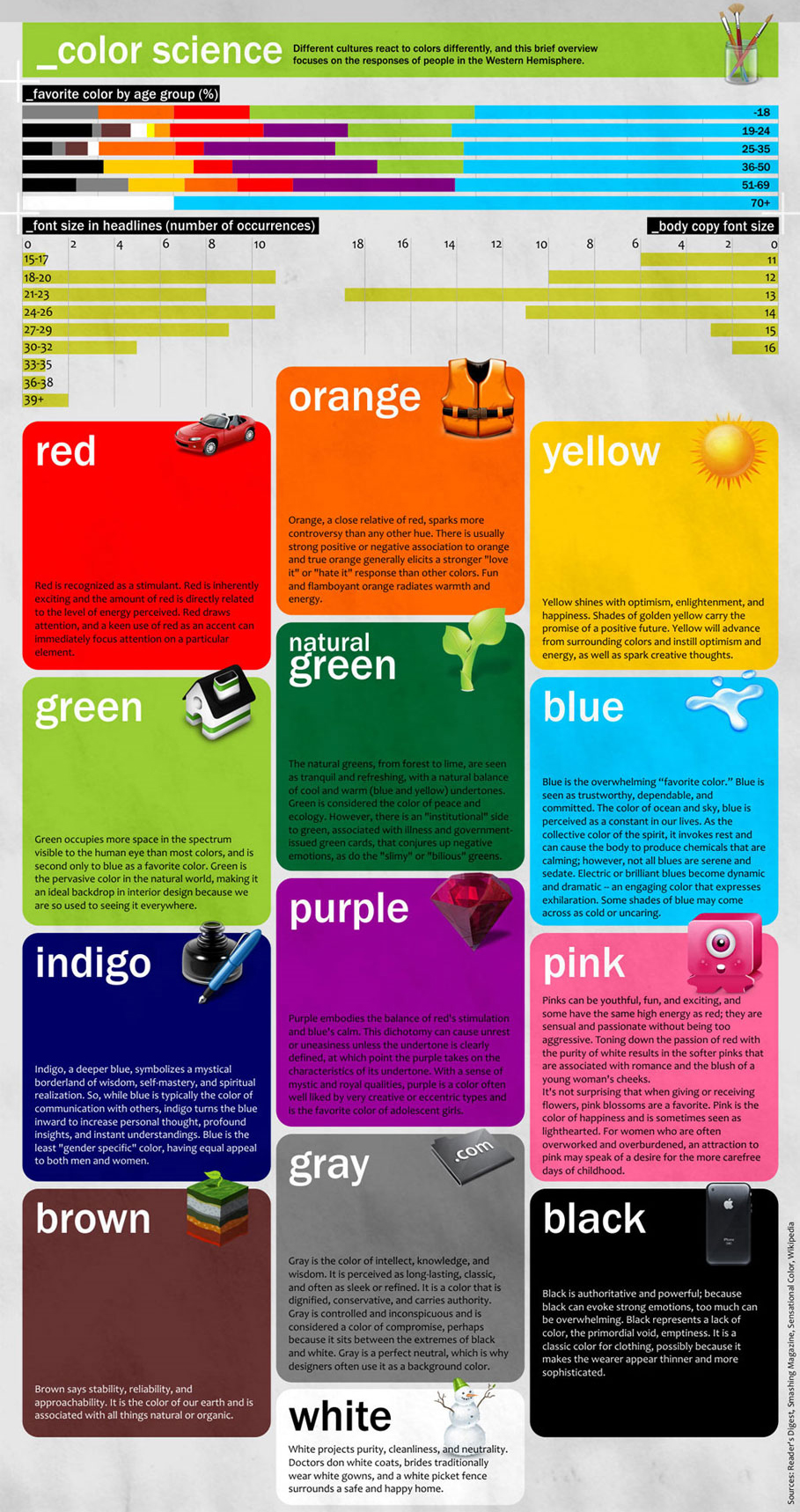
Most people know that colors can affect your mood – we all have a favorite color, right? Well, color theory doesn’t just cover the physics of light waves and the chemistry of blending paints. Color Theory is deeply rooted in contemporary psychology.
Most chain restaurants have the same colors in their logos. This is because Reds, Yellows, Browns, and warmer colors we might typically associate with a holiday like Thanksgiving tend to make people hungry. It’s true – next time you head past a chain check out the logo but resist the temptation!
Theory
Studies continually support the theory of colors and how they affect the human psyche. At Tingalls Graphic Design we use colors everywhere to stimulate the creative mind.
Here’s a quick guide to common color theories and how these colors can be used for in your work environment:
Orange
Associated with value and worth – ever been to Home Depot? The feeling it gives folks is that the work they are doing or the product they are buying is a strong value.
Green
Said to increase concentration, green is a typically comforting color that inspires reassurance and confidence.
Blue
A calming color, but blue can also be distracting as the light waves vibrate a little more intensely. Use gently!
Black / Grey / White
Fear, depression, boredom, paranoia, unfriendly and of course lowers productivity. Avoid at all costs.
Red
An emotional color alternating between passion and anger, research indicates that red reduces concentration.
Purple
The traditional color of royalty since Roman times, purple inspires confidence and causes employees to value their contributions. However, like blue, purple should be used sparingly.
If your office is a downer (and you might not know it), try a coat of paint to change attitudes, expand spaces and open minds.
And play Spoons.


