Tingalls 7 Rules for Logo Design
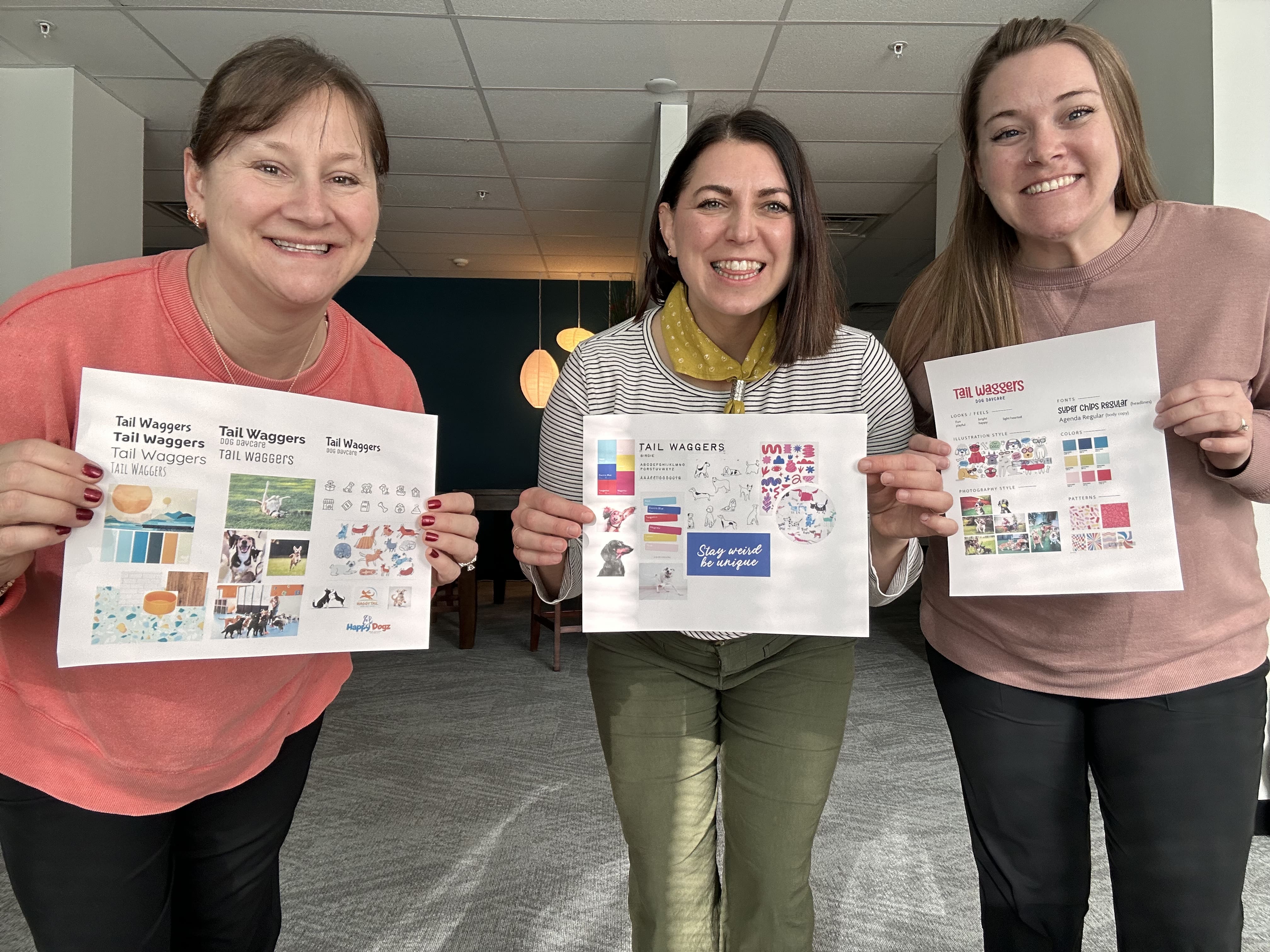
![]() At Tingalls, we have developed a reputation for being amongst the very best in Madison, WI for logo design. However, while lots of clients tend to assume our success with branding has to do with an innate sense of artistic talent and creativity, that’s only part of the equation. In fact, we always try to adhere to seven firm rules about logos, and advise the business owners we work with to do the same.
At Tingalls, we have developed a reputation for being amongst the very best in Madison, WI for logo design. However, while lots of clients tend to assume our success with branding has to do with an innate sense of artistic talent and creativity, that’s only part of the equation. In fact, we always try to adhere to seven firm rules about logos, and advise the business owners we work with to do the same.
Here are seven things to remember if you want to end up with a logo that’s stunning, unique, and memorable.
#1 Keep Things Simple
Often, clients have a lot of things they want to “say” with their new logo design. That’s understandable, given that your visual marker is going to be a big part of your brand. However, it’s also true that simpler logos are easier to understand and identify. And, that your logo is only one piece of your company’s branding. Think of Nike’s swoosh, the McDonald’s arches, or the simple image Apple uses. These are excellent examples of how a simple, straightforward logo can serve you well.
#2 Use Vectors for High Resolution
You might be tempted to use photographs in your logo, but that’s almost always a bad idea. For one thing, photos tend to be busier than vector images (see rule #1). Additionally, you want to end up with a visual that looks good at any resolution. That’s very difficult to achieve with any kind of photograph.
#3 Balance Text and Icons
Your logo shouldn’t be dominated by text. Even if your logo is almost entirely text-based, there are ways you can manipulate or sculpt the lettering to incorporate an interesting visual element. On the other hand, make sure the text in your logo doesn’t get “drowned out” by the other visual elements.
#4 Give Yourself Color Choices
While there certainly isn’t anything wrong with having a colorful logo, recognize that at some point you may want or need a version of your logo that’s printed or displayed in a single color. Knowing that, you should use shapes and styles in your logo that can be easily translated into a single color format. In other words, if essential details in your logo disappear when you take away the coloring, it might be time to go back to the drawing board.
#5 Have a Logo That’s Scalable
Most logo design clients envision their new visual identity being applied to a website or business card. However, it’s entirely possible that your logo might one day find its way to the side of a pen, a flash drive, or even a billboard. It could be added to a tradeshow banner or some other large display. For that reason, your logo needs to be something that can be scaled up or down without losing its identity or effectiveness.
#6 Choose Your Fonts Wisely
You want no more than three fonts in your logo, and fewer is often better. The choice of fonts is crucial, as well. You want to use a text style that matches the personality you’re trying to convey with your company, while at the same time ensuring that your logo will be readable both close-up and from a distance.
#7 Stay Away From Clip Art
You never want to use clipart in your logo. That’s because your company’s visual identity is supposed to be distinct and unique. If your logo has a generic feel to it, or if another company is using something very similar, then the value of your brand is decreased. Don’t settle for visuals that haven’t been created specifically for your business or organization.
Is it time for your business to get a brand-new visual identity or a fresh take on an existing logo? If so, now is a great time to speak with the Tingalls team and discover why we are considered the best in Madison for branding and logo design. Call us today to set up a free consultation!
Check out our Full Logo Portfolio >>
![]()
Related Posts