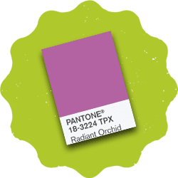
Has Pantone’s Color of the Year Affected Your Branding?
Now that we’re well into 2014, how do you feel about Radiant Orchid as the Pantone color of the year? Is it something you’ve used in your designs and branding, or is this the first time you’re hearing about it?
I asked some of the Tingalls team how they feel about the color, and if it’s influenced how they design and think.
Overall, they felt that although it’s interesting to see what color Pantone picks each year and how they apply it, it has very little affect on their work.
"All of our designs are very client driven. We tend to brand for our customers in a more timeless way and not pay too much attention to the trend of the year when it comes to branding. In many cases, clients already have an established color palette, or if it's a new business, our client isn't wanting something that's trendy — but colors that will stand the test of time."
When we create branding for clients, we’re looking to craft something that’s as unique as they are. We take our queues from our clients, so that the end result is a good representation of who they are and where they want to go as a company.
Although we’re interested in industry trends, they don’t drive our decisions. What drives us is finding long-term solutions that help improve our clients’ business and reputation. That being said, we always follow best practices to ensure that a client’s project is completed to the highest standards. Whether it’s coding a website properly to ensure it’s SEO friendly, or making sure bleed marks on a palm card are right, best practices stand the test of time, while trends may come and go.
Have an opinion about Radiant Orchid? Feel free to share below.
If there’s any way that we can be of service, give us a shout at Tingalls!

