Separating the Amateurs from the Professionals in Graphic Design
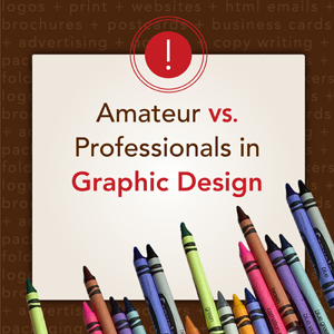
Sometimes too much of a good thing is actually a bad thing. This can happen in a lot of places, but we’re particularly sensitive to it when it comes to graphic design. At one point everyone held a crayon in their hand and realized that they could color and draw. It was exciting, rewarding and you needed more. Eventually, you packed as many crayons as you could into your pudgy little hand and tried coloring with all of them at once, with varying degrees of success. This is basically what happens when some people discover graphic design, and we’re all for it. We want people to experiment and learn how to use the tools of our trade; we just don’t want professional websites to fall victim to a crayon novice.
Helvetica
Helvetica is like vanilla ice cream, sure it’s delicious, but wouldn’t it taste better with a little something added? What we’re trying to say is yes, Helvetica is a very popular font but try something else, you may find you like it better.
Learn Punctuation, Spelling and Grammar
Do you know the difference between prime marks, apostrophes, quotation marks and accent marks? Do you know when to use the words their, there and they’re? Spelling, grammar and punctuation are key to getting your message across and not losing the meaning of your words. Sometimes, just one of these mistakes will cause a reader to lose faith in all of your content.
No More Double Returns or Spaces
Back when a typewriter sat on every desk it was common to hit return twice to space out lines of type and to add a double space after a period, before a new sentence. Today that leaves gaps and odd breaks, so unless you’re using a typewriter, single returns and single spaces only
Embossing & Drop Shadows
These nifty little tools come with your software, but that doesn’t mean you have to use them. A website packed with embossing and drop shadows is one of the biggest tip offs that your website was designed by an amateur.
Underlining and CAPS
Underlining and using all caps are great ways to add emphasis if you’re handwriting a note, but if you’re designing a website then save the underlines for hyper links and use all caps sparingly. If you need to emphasize something try bold and italics instead.
Contact Tingalls Graphic Design if you want to have your website handled by professionals in the graphic design field, i.e. Crayon Experts.


