Marketing Tips & Tricks
Search by Category:
About Tingalls • Advertising • AI • Branding • ChatGPT • Color • Copywriting & Blogging • Email Marketing • Google • Graphic Design • Logo Design • Marketing • Marketing Coaching • Networking • Nonprofit Design • Print & Package Design • Search Engine Optimization • Social Media Marketing • Start-ups • Tips • Tradeshow Marketing • Website Design
Search by Keyword:
Website Design in Madison, WI — Is Yours Actually Working?
If you've ever Googled "best web design near me" and landed here — good. You found us. Here's the thing though. Lots of Madison businesses have a website. What they don't have is one that does anything for them.
Why Every Remodeling & Trades Business Should Be on Nextdoor
If you’re a remodeler, electrician, plumber, landscaper — any kind of trades-based business — you live and die by local visibility. And one simple tool that often gets overlooked? A business listing on Nextdoor.
How to Use ChatGPT to Generate Website Blog & FAQ Ideas
If you’ve ever stared at a blank screen trying to come up with blog ideas or FAQs, you’re not alone. The good news? There’s a simple way to get unstuck.
Branding Trends
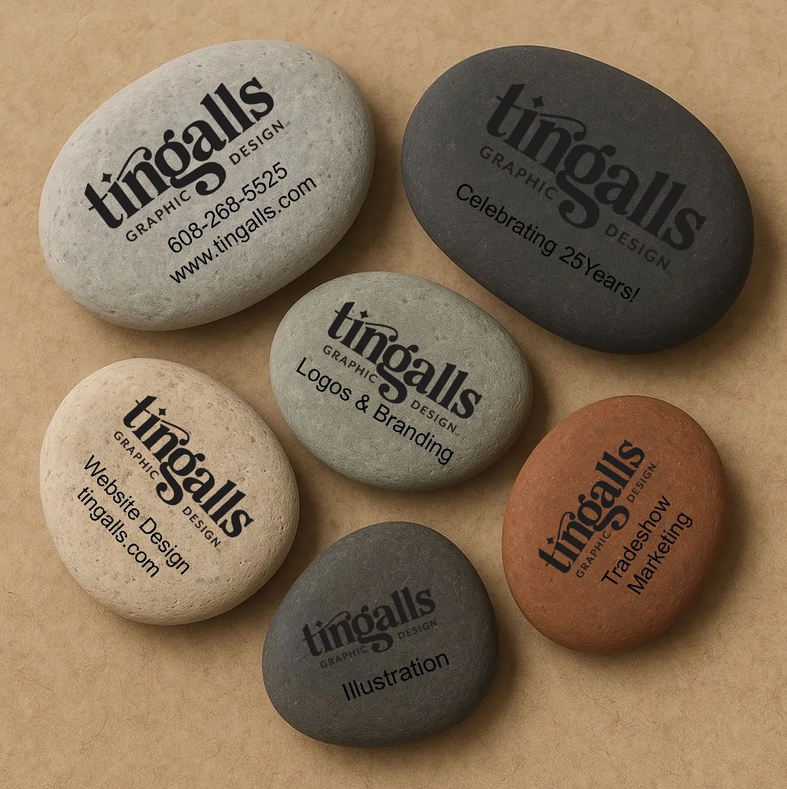
Tingalls Graphic Design is proud to introduce the latest breakthrough in business networking — Brand Stones. While business cards get lost, bent, or tossed aside, Brand Stones are designed to make a more… solid impression.
Is ChatGPT Replacing Google for Small Business Searches?
Businesses don’t sign up to appear in AI results — they earn their way in through strong content, clear information about what they do and where they work, and regularly publishing helpful material.
In other words, it’s not magic. It’s just good marketing.
Is Your Blog Helping Your SEO — or Working Against You?
A blog can help your SEO — but only if it lives on your main website and supports your content strategy. Here’s how to make sure your blog is actually working for you.
Why Business Cards Are Still Relevant in a Digital World
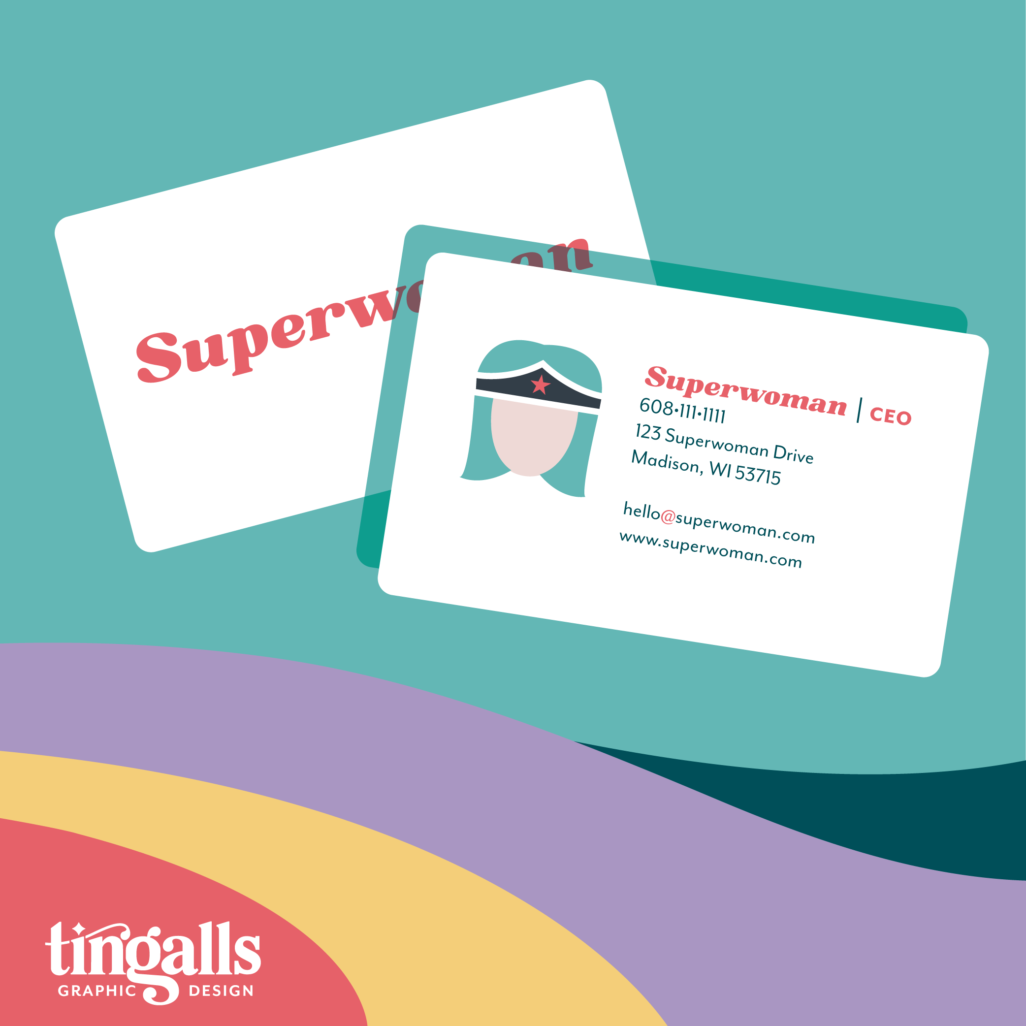
A business card is often the last thing someone sees after a great conversation. It’s the small reminder that says, “Oh yeah, I liked them.” When it’s thoughtful and well designed, it sticks. When it’s not, it gets lost in a pocket—or buried in a tradeshow bag of goodies.
Tradeshow Planning Starts Long Before the Show
Many companies sign up for a tradeshow and don’t think about it again until a few weeks before the event. That’s usually when they realize they need a booth, banners, and handouts—fast. To get real results, your tradeshow design and materials need the same level of planning as any other marketing campaign.
What are QR Codes and How to Use Them
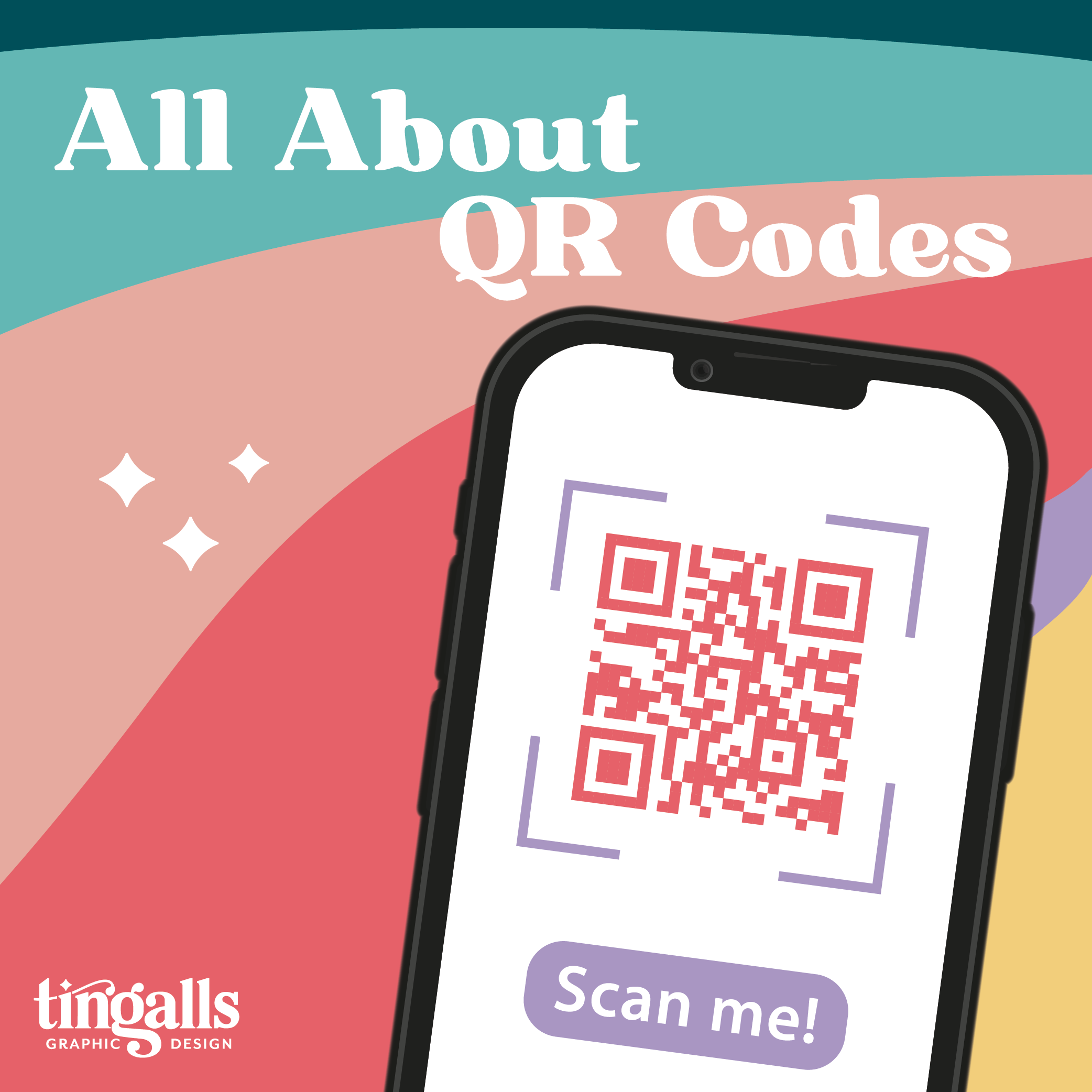
In today’s world, where phones are always within reach, QR codes are one of the easiest ways to bridge the gap between print and digital marketing.
SEO for Small Businesses: What Still Works
SEO doesn’t have to be expensive. Here are the easiest, most budget-friendly ways small businesses can boost visibility on Google in 2025 — without complicated retainers or tech jargon.
3 Key Components of a High-Performing Website
A high-performing website in 2025 is simple, clear, and built around your visitor’s experience. Here are the three components every site needs to actually work for your business.
2026 Website Trends on the Horizon
Curious about what’s coming for websites in 2026? Here are the design and usability trends gaining momentum and how they’ll impact small businesses.
Safeguarding Your Small Business: Tingalls Comprehensive Checklist for Choosing a Trustworthy Digital Marketing Partner
A few years ago, we made the decision to hire an external agency to help improve our visibility in Google search results. Within just a few short months, their actions disastrously and negatively impacted Tingalls’ online presence for our top three keyphrases.
The Real Reason Your Website Isn’t #1 (Yet)
Most business owners want that #1 Google spot, but ranking higher only works if your website actually converts visitors. Here’s why your competitors might be outranking you — and what you can do about it.
From Daunting to Done: Copywriting Tips for Your New Website Design
Writing copy for your new website can often feel daunting, like that lingering item on your to-do list. It's a significant undertaking, weaving together various elements to create a website that's not only functional but also engaging and reflective of your company or organization's unique brand.
How to Choose the Right Email Marketing Platform for Your Small Business or Nonprofit
If you’ve dipped your toes into email marketing, you already know there’s no shortage of tools out there. Constant Contact, Mailchimp, ActiveCampaign … the list goes on. So, how do you know which one is right for your small business or nonprofit?
10 Ways to Supercharge Your Google Business Profile
Is your Google Business Profile putting your company’s best foot forward? For most businesses, this is the very first impression prospects get of you online. A polished, updated profile acts like a welcoming “digital front door,” while an outdated one can quietly turn people away.
Back to School, Back to the Basics: Good Graphic Design Matters
September brings sharpened pencils, crisp notebooks, and the smell of fresh crayons. It’s also the perfect time for businesses to get “back to school” with their own marketing—brushing up on the basics of eye-catching, consistent graphic design.
10 Google Analytics Metrics You Should Be Watching
Ever wish your website visitors could just tell you what’s working and what’s not? While they won’t send you a memo, you can get a ton of insight from their behavior using Google Analytics 4 (GA4).
Tingalls 7 Rules for Logo Design
While lots of clients tend to assume our success with branding has to do with an innate sense of artistic talent and creativity, that’s only part of the equation.


