Packaging Design
 If you manufacture any sort of product, you know how important packaging design is. Regardless of your industry, there is a bevy of competing products. So how do you get your product recognized and ahead of the competition?
Color
Colors not only affect your mood, but they make a statement. We automatically and involuntarily associate certain colors with sensations and emotions. There is a sub-text of concept that comes with each color (red means stop or danger). The human mind likes associations, and as vision is one of more powerful and most relied on senses, the use of color logically can be used to influence people. There are vast tomes dedicated to the psychology of color and color theory. Just bop over to this blog about Tingalls Culture for the quick and dirty on color and mood. Then, consider the colors of your products packaging.
Did you know?
White packaging:
- Adding red suggests excitement and draws attention to the product
- Yellow decoration implies a more light-hearted, happy and fun product
- Black decoration or printing adds a feeling of sophistication and prestige.
Black packaging: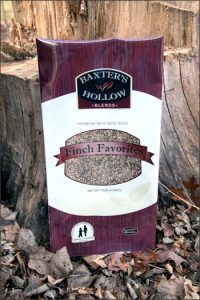

- Adding gold to the packaging creates elegance and sophistication to attract a wealthier market
- Silver has a similar effect
- Black with red has an adult or sexual connotation; however people of Spanish background like the combination of black and red as it is a part of their heritage
- Adding pink softens the message and attracts the female market
- Magenta makes it more striking and attractive to the non-conformists and more creative customers
- The brighter the colors you add to the packaging the less serious it becomes.
Source: http://www.empower-yourself-with-color-psychology.com/packaging-colors.html
Clean: Less is More – The Bauhaus Approach
Take a look at this Helvetica Beer packaging. Compared to many of its contemporaries, it’s plain boring. But look closer – try to imagine it on the shelf with all the other cans and bottles. The labels are all beautiful and clever, but they are busy and confusing and you just can’t see, exactly what you are buying. Then, you glance back to the Helvetica. Simple. Clean. You grab it, and Bob’s your uncle, the packaging design worked.
Bauhaus is an art movement that simply put, “less is more.” The example of Helvetica Beer is the perfect case study. Think of all the successful brands you enjoy – their packaging is aligned to brand standards, but is consistent and simple. Think of any Apple product you’ve ever purchased. See? Bauhaus.
Packaging In The Retail World
Some products are intangible – Netflix, a mechanic, software even. Some, however, sit on shelves and wait to be seen, grabbed and purchased. They’re competing with all the other products on the shelf (or stage, as it were.) So how do you differentiate your product from the competition?
Here are some quick tips:
- Remember your brand message – what are you saying to your customers?
- Is a signature color appropriate?
- Who is your audience?
- Is your product global? Are there cultural nuances you should be aware of?
- What feelings does your packaging and color choice invoke?
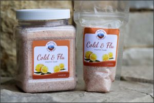
The gist of the story is that how you present your product can affect how successful it is. At Tingalls Graphic Design, we’ve got experience designing successful product packaging for a variety of industries, from bourbon to cookies, feed and seeds, and more.
Click here to see some of our packaging work!
Related Posts